A little place we like to call our playbook
Everything you need to put Studio Six F into the world the way it was designed: our logos, colours, type and pattern, with the reasons behind each one. Keep it open while you work.
- 01Form
- 02Feeling
- 03Function
- 04Flexibility
- 05Finesse
- 06Focus
Hidden in plain white
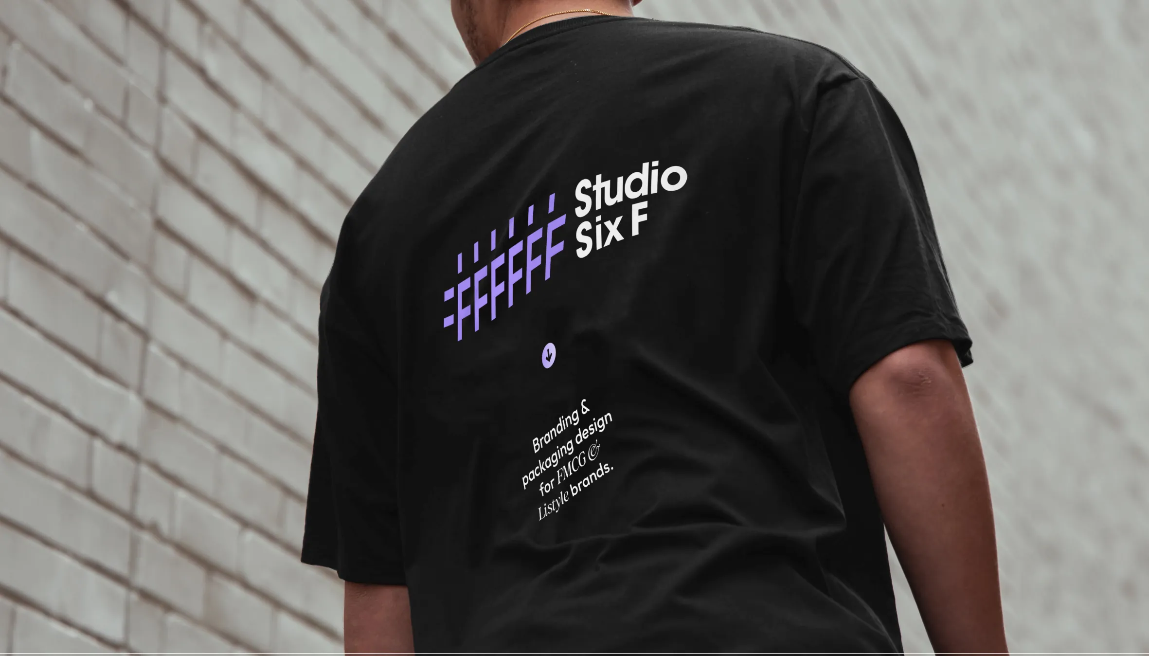
Our logomark is built from the hex code for white. The hash becomes the two short bars on the left, and each of the six Fs that follow tells its own story: the six principles we design by.
It is why our first colour is called Six F White, and why the mark always sits on its own, never redrawn or rearranged.
Designed around six Fs
Studio Six F transforms FMCG brands into market leaders through strategic brand identity and packaging design. Every project is shaped by the same six principles, so the work looks good and sells.
- Form
- Feeling
- Function
- Flexibility
- Finesse
- Focus
The building blocks
Four foundations make Studio Six F instantly recognisable. Learn them once and every deck, post, sign and email will feel like us.
Four colours, one gradient
Black and white do the heavy lifting. Finesse Indigo brings the personality. Every chip shows how readable black or white text is on it, measured against the WCAG contrast standard.
Six F White
Black text · #ffffff
Six 0 Black
White text · #000000
Finesse Indigo
Black text · #ad94ff
Flexible Indigo
Black text · #bab0ff
Made for shelves and screens
The playbook describes how Studio Six F presents itself. This is what that brand stands behind: identities and packaging that grab attention, build trust and stay in people's minds.





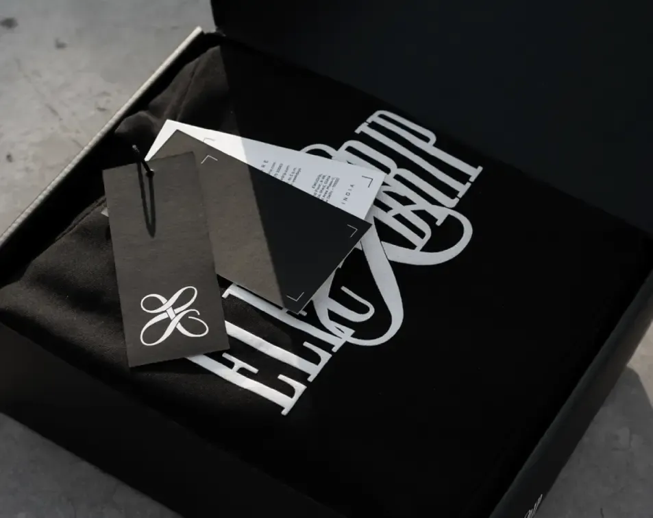

Some of the brands we have built