Make a pattern
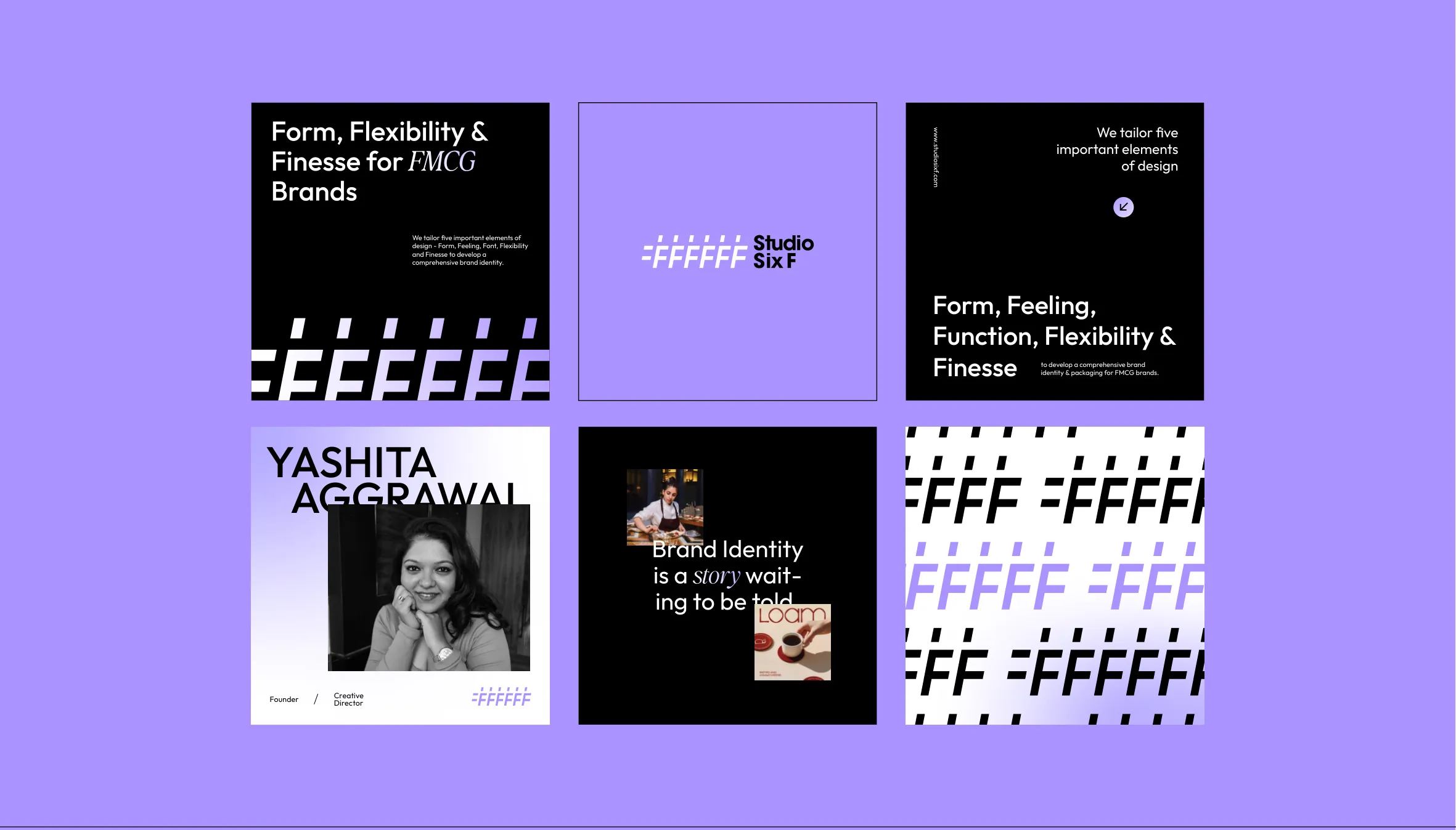
Rows of logomarks, every other row shifted by half a step. Choose an approved colourway and a scale, then download it as a vector file.
Colourways use the suggested pairings from the colour page: the background is the back colour, the logomarks are the front colour.
Where to use it
- Printed material
- Digital presence
- Physical spaces and gestures
- Merchandise

Use it with care
Suggested Practical tips that follow from the logo and colour rules. They are not written in the 2024 guidelines yet.
- The pattern is decoration. Keep text and the logo off busy areas of it, or give them a solid panel.
- Use whole logomarks at one size per layout. Don't rotate, skew or mix scales.
- Stick to the colourways above. Avoid the pairings the colour page lists as ones to avoid.