Three versions
Choose the version that sits well on the space you have. Switch versions and backgrounds to see each approved combination.
Primary logo
A distinctive logomark built from the hex code for white, where each F tells its own story, paired with a modern, minimalist logotype. Use it whenever it fits.
Use on the website, banners, signage, brand documents, social media images and email signatures.
- Minimum, print
- 1.5 in wide
- Minimum, screen
- 235 px wide
- Clear space
- 1.35x width, 2.65x height
Secondary logo
A minimised version with only the logotype. It keeps Studio Six F represented consistently where the primary logo can't fit well.
Use where the shape of the space suits the stacked logotype better than the wide primary logo.
- Minimum, print
- 0.75 in wide
- Minimum, screen
- 133 px wide
- Clear space
- 1.9x width, 2.65x height
Logomark
The most minimal variation: only the mark. Designed for the smallest spaces, when the primary and secondary logos are too large.
Use it so the brand is represented whatever the size constraints. It is also the building block of our pattern.
- Minimum, print
- 0.8 in wide
- Minimum, screen
- 147 px wide
- Clear space
- 1.5x width, 2.65x height
Minimum size
A minimum size keeps the logo's impact and legibility intact. Drag the slider to see where each version stops working.
| Version | Print (width) | Screen (width) |
|---|---|---|
| Primary logo | 1.5 in | 235 px |
| Secondary logo | 0.75 in | 133 px |
| Logomark | 0.8 in | 147 px |
Clear space
To look their best, our logos need space to stand out. Nothing else should enter the shaded area.
- Draw a box right around the logo.
- Multiply the width of the box by the number given for that version.
- Multiply the height of the box by 2.65. The result is the space the logo needs.
Colour combinations
The default logo uses our two primary brand colours, Six F White and Finesse Indigo, on black. The logo can also live on these grounds.
Default. Finesse Indigo and Six F White on Six 0 Black.
Six F White and Six 0 Black on Finesse Indigo.
Finesse Indigo and Six 0 Black on Six F White.
Finesse Indigo and Six 0 Black on the Finesse Gradient.
Do
Recommended ways to bring the logos into our work.
Use the preferred colour logo. Six F White and Finesse Indigo first. For variety, use another approved combination.
Use the clear space. Always leave the right amount of breathing room around the logo.
Use the right version for the touchpoint. Pick the variation that sits well on the space available.
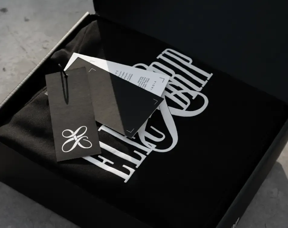 4
Place it on key visuals only when it stays legible. And only when the space allows it.
Don't
Common mistakes. Always avoid these.
Don't angle the logos.
Don't apply gradients to the logos.
Don't stretch or squash the logos.
Don't step outside the brand colours.
Don't add drop shadows or other effects.
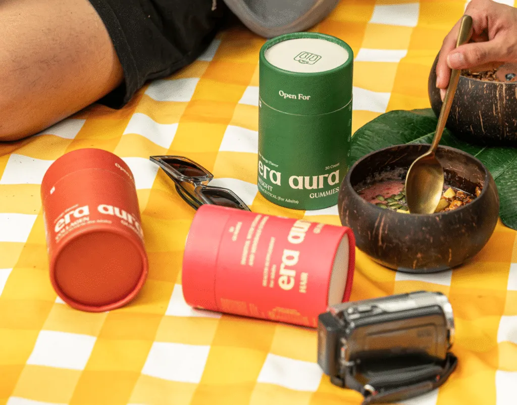
Don't place the logos on images without enough contrast.